What Is a Hero Section and Why Does It Make or Break Your Website
The hero section is the first thing a visitor sees when they land on your website. It sits above the fold, occupies the most valuable digital real estate on your page, and has roughly three to five seconds to convince someone to stay. That is not a lot of runway. In 2026, with attention spans under persistent siege from competing platforms and content formats, your hero section is no longer just a design element. It is a conversion asset. For B2B companies especially, the hero section needs to do heavy lifting fast. It has to communicate who you are, what you do, who you do it for, and why it matters, all before the user even thinks about scrolling. When it works, it anchors your entire funnel. When it does not, it quietly bleeds traffic and revenue in ways that are easy to overlook until the data catches up.
The Anatomy of a High-Converting Hero Section
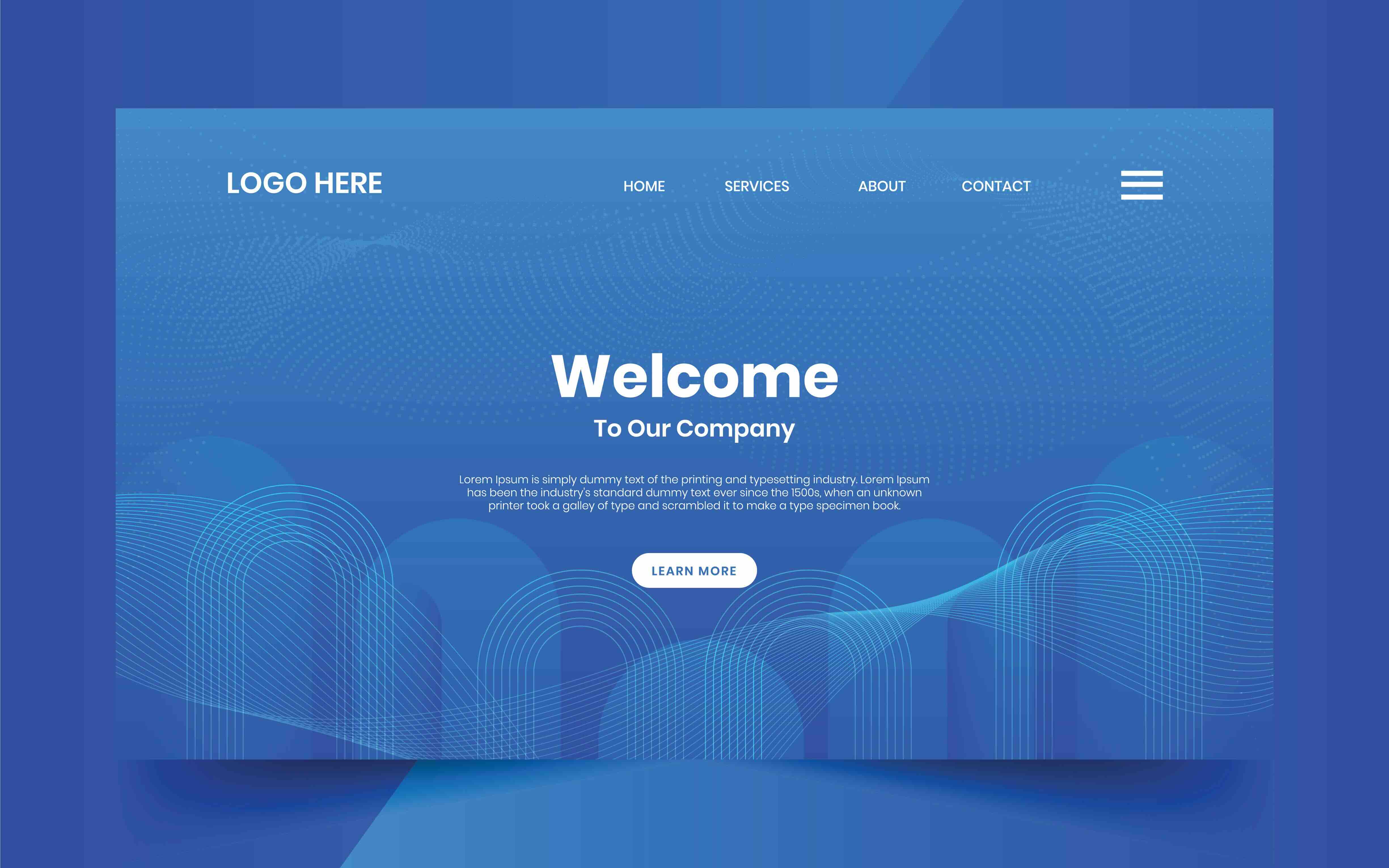
Understanding what goes into a well-structured hero section is the first step toward building one that actually performs. Most high-converting hero sections share a handful of consistent components: a primary headline, a supporting subheadline, a clear call-to-action, a visual element (image, video, or illustration), and some form of social proof or trust signal. Each of these elements carries its own weight in the conversion equation. The headline is the loudest signal. It should articulate the core value proposition in plain, direct language, free of jargon or empty marketing language. The subheadline gives you a bit more room to breathe and expand on the "how" or "who." The call-to-action button should be specific and outcome-oriented rather than generic. "Get My Free Audit" outperforms "Learn More" in virtually every A/B test scenario, and that margin compounds over thousands of sessions. The visual should complement the message, not compete with it. And the trust signal, whether that is a client logo strip, a review badge, or a stat, anchors credibility before the user has a chance to question it.
Headline Strategy: Speaking to Pain Points, Not Features
One of the most consistent mistakes B2B companies make in their hero section is writing headlines that center the product or service rather than the customer outcome. A headline like "Enterprise-Grade Project Management Software" tells the visitor what you built. A headline like "Stop Losing Billable Hours to Broken Workflows" tells them what you solve. The difference is psychological, but the downstream impact is measurable. Effective hero section copywriting starts with a deep understanding of the customer's primary pain point and the specific language they use to describe it. This is where voice-of-customer research, user interviews, and search query data become indispensable creative inputs. The headline should feel like it was pulled directly from the user's own internal monologue. When that alignment happens, the page does not feel like marketing. It feels like recognition, and that is where trust begins.
Visual Hierarchy and Layout Best Practices
Visual hierarchy in a hero section is about guiding the eye with intention. Your layout should direct attention in a deliberate sequence: headline first, subheadline second, CTA third, visual support fourth. This is not arbitrary. It mirrors the natural reading pattern of most Western users, which moves left to right and top to bottom in an F or Z pattern depending on the layout type. In terms of structural conventions, the split-layout hero (text on the left, image or video on the right) remains one of the most effective formats for B2B landing pages because it separates the visual and textual content into distinct zones, reducing cognitive load and improving scanability. Full-width background images or video loops can be impactful when used with strong contrast and overlay control, but they introduce performance risks if not handled with care. Typography scale also matters. The headline should be large enough to read effortlessly at a glance, the subheadline noticeably smaller, and the CTA button visually distinct through color contrast, size, and proximity to the headline block.
CTA Design: The One Button That Carries Everything
If the headline is the hook, the call-to-action is the catch. CTA design in the hero section is one of the most tested and debated topics in conversion rate optimization, and for good reason. A poorly designed or poorly worded CTA can neutralize even the most compelling headline. There are a few principles worth internalizing here. First, specificity wins. The more clearly a CTA communicates what happens next, the more likely users are to click it. Second, placement matters more than most people realize. The CTA should sit within natural eye flow, typically directly beneath the headline or subheadline block, without requiring the user to search for it. Third, button color should contrast against the background without clashing with the overall palette. High contrast does not mean neon. It means visible and distinct. Fourth, include a micro-commitment reducer near the CTA, something like "No credit card required" or "Takes less than 2 minutes." These small friction-reducers do measurable work in lowering psychological resistance to clicking.
Key Advantages of a Well-Designed Hero Section
Investing intentionally in your hero section yields compounding returns across your digital marketing stack. Here is where the value concentrates:
- Improved first-impression conversion rate and reduced bounce rate
- Stronger alignment between ad messaging and landing page content (message match)
- Higher quality score in paid search campaigns due to improved landing page relevance
- Better organic performance through clearer topical signals and longer dwell time
- Increased trust and credibility through consistent visual identity and social proof
- Accelerated sales cycles when the hero section pre-qualifies the right audience upfront
The ripple effect matters. A stronger hero section does not just improve on-page performance. It feeds better data into your paid media algorithms, reduces wasted ad spend, and improves overall cost-per-acquisition at the campaign level. For B2B companies running lead generation campaigns, even a modest improvement in hero section conversion rate can translate into significant revenue impact at scale.
Common Drawbacks and Pitfalls to Avoid
Even well-intentioned hero section designs fall into predictable traps. Understanding these drawbacks is as important as knowing the best practices, because the mistakes are often invisible until they show up in your analytics. Overloading the hero with too much information is the most common offender. When a hero section tries to communicate everything, it communicates nothing. Users experience what UX researchers call "decision paralysis," and they scroll or leave rather than engage. Weak contrast between text and background is another frequent issue, particularly on pages using photographic backgrounds. If the headline is hard to read on mobile, you have lost a significant portion of your audience before the page even loads fully. Speaking of mobile, a hero section that looks polished on desktop but breaks on a 390-pixel screen is a liability, not an asset. Mobile-first design is not a trend. In 2026, it is a baseline expectation. Finally, using stock photography that reads as generic or inauthentic undermines trust at a subliminal level. Users recognize stock imagery instinctively, and it signals that a brand did not invest in its own visual identity.
Performance, Accessibility, and Technical Considerations
A hero section that looks stunning but loads in four seconds is a conversion killer dressed as a design win. Page speed is a ranking factor and a user experience factor, and the hero section is often the heaviest element on the page due to large image or video assets. Optimizing hero imagery through modern formats like WebP or AVIF, lazy loading secondary assets, and compressing video files without visible quality loss are non-negotiable technical steps. Accessibility is equally important and frequently underestimated in B2B contexts. Alt text on hero images, sufficient color contrast ratios that meet WCAG 2.1 AA standards, and keyboard-navigable CTA buttons are not just compliance checkboxes. They expand your reachable audience and signal to search engines that your page is well-structured. Structured data and proper semantic HTML in your hero section also reinforce topical relevance signals that support organic rankings. The best-performing hero sections are those where design, copy, and technical execution are treated as a unified system rather than separate deliverables handed off in sequence.
Why Kreativa Group Is the Right Partner for Hero Section Design That Converts
If you have read this far, you already understand that a great hero section is not a creative exercise. It is a strategic business asset. And building one that actually performs requires a team that thinks in terms of outcomes, not aesthetics. That is exactly what Kreativa Group does. Based in Los Angeles and Miami, Kreativa Group is a full-service marketing and creative agency whose leadership team has designed websites and digital experiences for global brands including Sandals Resorts, Porsche, Audi, and BMW, as well as work produced for agencies like Young and Rubicam. They have managed paid media for multi-billion dollar brands including Newegg, Rakuten, and Fossil Group, and have driven over 200 million dollars in incremental revenue with an average of more than 7x ROAS and a 4% conversion rate across campaigns. They have launched over two dozen websites on Webflow, Shopify, and WordPress, and they sit among the top 1% of all US-based agencies certified across Google Ads, Amazon Ads, Shopify, and Webflow. What separates Kreativa Group from the average agency is a singular focus on business outcomes over vanity metrics. If you are ready to turn your hero section into a genuine growth driver, start by exploring what Kreativa Group's marketing and creative agency services can do for your business, or take the first step and claim your free website and growth audit to see exactly where your current hero section may be costing you conversions.
Frequently Asked Questions About Hero Section Design Best Practices
What is the primary purpose of a hero section on a website?
The hero section serves as the first point of engagement between your brand and a visitor. Its primary purpose is to communicate your core value proposition, establish credibility, and prompt a specific action, all within the first few seconds of a page visit. It functions as both a brand statement and a conversion trigger.
How long should the headline in a hero section be?
Hero headlines perform best when kept between six and twelve words. The goal is clarity and immediate impact. Longer headlines increase cognitive load and reduce the likelihood that users will absorb the full message before their attention shifts.
Should a hero section include a video background?
Video backgrounds can increase engagement and brand perception when used purposefully, but they introduce page speed risks. If you use a video background, keep the file size under 5MB, remove audio by default, and ensure sufficient text contrast through overlays. Always test performance on mobile before publishing.
How many calls-to-action should a hero section have?
In most cases, one primary CTA is ideal. A secondary CTA is acceptable when it serves a distinct audience segment, such as pairing "Get a Demo" with "View Case Studies." Avoid offering three or more options, as this introduces decision friction and dilutes click-through rates on your primary conversion path.
What makes a hero section effective for B2B companies specifically?
B2B hero sections need to speak to business outcomes and address specific pain points faced by decision-makers. They should include trust signals like client logos, certifications, or measurable results, and the CTA should align with where the buyer is in their consideration journey, typically early to mid-stage for cold traffic.
How does hero section design affect SEO performance?
A well-structured hero section contributes to SEO through improved dwell time, reduced bounce rate, proper semantic HTML, and keyword-aligned copy that reinforces topical relevance. Page speed, which the hero section heavily influences, is also a direct Google ranking factor for both desktop and mobile search.
What image formats are best for hero section visuals in 2026?
WebP and AVIF are the recommended formats for hero imagery in 2026. Both offer superior compression compared to JPEG and PNG without significant quality loss. Using next-generation image formats directly supports Core Web Vitals performance scores, particularly Largest Contentful Paint, which often maps directly to the hero image element.
How often should a hero section be updated or tested?
Hero sections should be reviewed and A/B tested at minimum quarterly, or any time there is a significant change in product positioning, target audience, or campaign messaging. Continuous testing of headline variations, CTA copy, and visual elements compounds improvements over time and prevents conversion stagnation.
Is social proof necessary in a hero section?
Social proof in the hero section, such as client logos, star ratings, or outcome-focused statistics, significantly increases trust for first-time visitors who have no prior brand relationship. For B2B companies especially, where purchase decisions carry higher stakes, social proof in the hero can meaningfully reduce skepticism and increase qualified lead conversion rates.
What is message match and why does it matter for hero section design?
Message match refers to the alignment between the ad or link that brought a user to your page and the headline they see in the hero section. When the language and promise are consistent across both touchpoints, users feel they have landed in the right place. Poor message match is one of the leading causes of high bounce rates on paid traffic campaigns.