Gradient Design Trends in 2026: What They Are, Why They Work, and How to Use Them Strategically
Gradients are everywhere right now, and that is not an accident. From SaaS landing pages to luxury brand campaigns, gradient design has quietly become one of the most versatile and visually powerful tools in a modern creative toolkit. But there is a difference between slapping a colorful blend onto a background and actually using gradient design with intention and strategy. This article breaks down what gradient design trends look like in 2026, how they function from a technical and aesthetic standpoint, and what your business should know before leaning into them. Whether you are a marketing director, a brand manager, or a founder trying to level up your visual identity, this is worth reading.
What Gradient Design Trends Actually Mean in 2026
Gradient design is not new. It has existed in visual communication for decades, but its current iteration looks nothing like the dated, oversaturated blends from early web design eras. Today, gradients are nuanced, intentional, and deeply tied to brand expression. In 2026, the dominant gradient design trends include mesh gradients, aurora-inspired color flows, duotone overlays, and noise-textured gradients that simulate depth and organic movement. These are not decorative afterthoughts. They are structural design choices that influence how a viewer perceives a brand, processes information, and ultimately responds to a call to action. The technical term for what is happening here is chromatic hierarchy, meaning the gradient is doing active work to guide the eye across a composition. That distinction matters enormously in a marketing and creative context.
The Technical Foundation Behind Modern Gradient Design
Understanding how gradients work at a functional level helps you make smarter creative decisions. A gradient is a progressive transition between two or more colors across a defined space. The key variables are the color stops, which determine where each color begins and ends, the direction or radial point of the blend, the opacity levels at each transition, and increasingly, the noise or grain overlay that is applied on top to prevent the flat, digital look. Mesh gradients are particularly sophisticated because they use a multi-point grid system to generate organic, irregular blends that feel almost three-dimensional. CSS and design tools like Figma have made these far more accessible in 2026, which is one reason they have proliferated so rapidly across digital interfaces. On the production side, designers working with gradients need to think carefully about rendering across screen types, color profile consistency between RGB and sRGB environments, and accessibility compliance, specifically contrast ratios that meet WCAG 2.2 guidelines.
Why Gradient Design Is a Strategic Asset for B2B Brands
Here is where things get genuinely interesting from a business perspective. Gradient design trends are not just a visual preference. They carry measurable strategic value when applied correctly. For B2B brands specifically, where visual identity has historically defaulted to conservative, flat design systems, gradients offer a meaningful opportunity to differentiate without sacrificing professionalism. Research in visual psychology consistently shows that color transitions attract and sustain attention longer than flat color fields. In digital advertising, that sustained attention translates directly to improved click-through rates and lower cost-per-acquisition. For website design, well-executed gradient backgrounds create natural visual depth that increases perceived brand sophistication, which influences trust and conversion behavior. In 2026, B2B buyers are increasingly sophisticated, and they are making vendor assessments partly on the quality of a brand's digital presentation. A thoughtfully designed gradient system signals that a company invests in its craft, and that signal carries weight.
Key Gradient Design Trends Dominating Creative Agencies Right Now
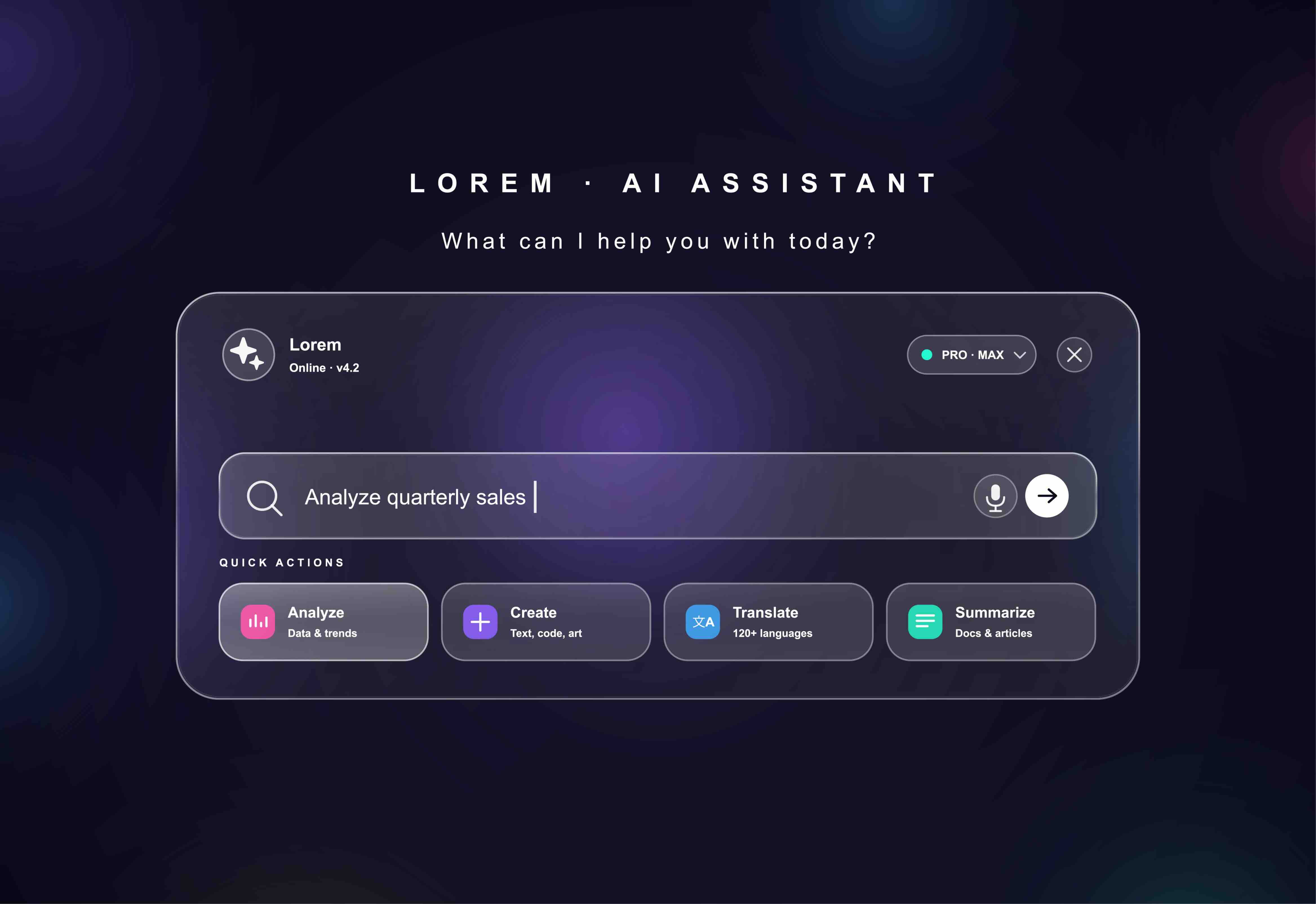
Creative and marketing agencies are not all chasing the same gradient aesthetic, but there are clear movements worth tracking. The most significant trend right now is the shift toward ambient gradients, which are soft, large-scale color fields that sit behind content without competing with it. These are distinct from hero gradients, which are designed to be the focal point. Another major trend is the integration of gradient design with glassmorphism, where frosted, semi-transparent UI elements float over gradient backgrounds to create layered, immersive interfaces. Branded gradient palettes are also gaining traction, where a specific gradient becomes as proprietary and recognizable as a logo. Think of how certain technology companies have trained audiences to associate a particular purple-to-blue transition with their brand. That level of gradient ownership is a legitimate brand asset. Finally, animated gradients are becoming standard in motion design and digital advertising, with subtle, slow-moving color shifts that add life to otherwise static compositions.
Gradient Design Applications Across Marketing Channels
Knowing which channels benefit most from gradient design helps allocate creative resources efficiently. The highest-impact applications include the following areas worth considering for your next campaign or redesign cycle.
- Website hero sections and landing pages
- Paid social ad creative for Meta, LinkedIn, and programmatic display
- Email headers and promotional banners
- Brand identity systems including logo marks and icon sets
- Motion graphics for video pre-roll and connected TV advertising
- Presentation decks and investor materials
- App UI and SaaS product interfaces
The Real Advantages of Embracing Gradient Design
The business case for gradient design is strong, but it is worth being specific about the advantages. First, gradients dramatically expand the expressive range of a visual identity without requiring a full rebrand. A company that has a solid flat logo and a defined color palette can introduce a gradient design system as a secondary layer that modernizes the brand's digital presence without disrupting recognition. Second, gradients perform well in high-competition advertising environments. When every competing ad in a feed uses flat color or photography, a well-crafted gradient immediately creates contrast and earns attention. Third, gradient design scales efficiently across formats. A gradient palette established for a website translates naturally to display ads, social content, and video, which reduces production time and improves brand consistency across channels. Finally, and perhaps most importantly for B2B marketers, gradients have a long shelf life when they are built around brand color logic rather than trend-chasing. A noise-textured mesh gradient rooted in your brand's core palette will feel current and ownable for years.
Common Drawbacks and Mistakes to Avoid
Gradient design trends come with genuine risks if they are approached carelessly. The most common mistake is using gradients decoratively rather than strategically, which produces visual noise that actually competes with the content hierarchy instead of supporting it. Another frequent issue is accessibility failure. Gradients that blend across similar luminance values create contrast problems for viewers with color vision deficiencies, and that is both an ethical concern and a legal exposure point as accessibility standards tighten in 2026. Production inconsistency is also a common problem, particularly for companies managing creative across multiple vendors or internal teams. Without a documented gradient design system that specifies exact color stops, opacity values, and approved use cases, gradients become chaotic rather than cohesive. Finally, there is the trend dependency trap. Adopting gradient design purely because it is popular right now, without anchoring it to brand strategy, creates a visual identity that will feel dated faster than a more considered approach.
How to Implement Gradient Design Without Losing Brand Consistency
Implementation is where most brands either win or stumble with gradient design. The process should begin with a gradient audit of your existing brand system to identify which color relationships already exist within your palette and where natural gradient pairings emerge. From there, a design team should develop a gradient style guide that defines approved color stop combinations, directional rules, opacity ranges, and usage contexts for each gradient variant. This guide becomes part of your broader brand standards documentation. On the technical side, CSS custom properties and design tokens in tools like Figma make it possible to manage gradient systems at scale across web and product environments. For advertising and print applications, it is critical to establish gradient export standards that account for color profile differences between digital and physical media. This level of documentation feels like extra work upfront but pays significant dividends in production efficiency and brand cohesion over time.
Why Kreativa Group Is the Right Partner for Gradient-Forward Creative Strategy
If gradient design trends have your attention, and they should, the next question is who you trust to execute them with both creative intelligence and business discipline. Kreativa Group is a marketing and creative agency based in Los Angeles and Miami with a track record that speaks for itself. Their leadership team has managed paid media and designed digital experiences for multi-billion dollar brands including Newegg, Rakuten, Fossil Group, Sandals Resorts, Porsche, Audi, and BMW, as well as global agencies like Young and Rubicam. They have also built and exited startups, including Misfit Wearables and HomeLister, which means they understand how design strategy connects to real business outcomes at every stage of growth. To date, Kreativa Group has driven over $200 million in incremental revenue, averaged over 7x ROAS and a 4% conversion rate, and launched more than two dozen websites on Webflow, Shopify, and WordPress. They are among the top 1% of US-based agencies certified across Google Ads, Amazon Ads, Shopify, and Webflow. What makes them different is their commitment to business outcomes over vanity metrics. If you are ready to explore how gradient design and broader creative strategy can move the needle for your brand, start by visiting Kreativa Group's marketing and creative agency website or take advantage of their free brand and growth audit to see exactly where your visual identity and marketing performance have room to grow.
Frequently Asked Questions About Gradient Design Trends
What is gradient design and why is it trending in 2026?
Gradient design is the use of progressive color transitions within visual compositions, ranging from simple two-color blends to complex mesh and noise-textured gradients. It is trending in 2026 because advances in design tooling, CSS capabilities, and screen technology have made sophisticated gradients more accessible and visually impactful than ever before, while audiences have developed a preference for immersive, dimensional digital experiences over flat design.
Are gradient design trends suitable for B2B brands or only consumer-facing companies?
Gradient design is highly suitable for B2B brands. In fact, B2B companies often have the most to gain because the category has historically defaulted to conservative visual systems, meaning a well-executed gradient design approach creates significant differentiation in crowded markets.
What is a mesh gradient and how does it differ from a standard gradient?
A mesh gradient uses a multi-point grid system to generate organic, irregular color blends across a surface, creating a depth and fluidity that a standard linear or radial gradient cannot achieve. Mesh gradients look more natural and dimensional, which is why they are particularly popular in 2026 for brand backgrounds and hero sections.
How do gradients affect website conversion rates?
Gradients influence conversion rates by guiding visual attention across a page, increasing perceived brand sophistication, and creating emotional resonance with color psychology. When implemented with strong contrast and clear content hierarchy, gradient design can measurably improve engagement metrics and conversion outcomes.
What accessibility considerations apply to gradient design?
The primary accessibility concern with gradients is color contrast. Gradients that transition through similar luminance values can create contrast ratios that fall below WCAG 2.2 minimum standards, making text difficult to read for users with color vision deficiencies. Any text placed over a gradient background must be tested rigorously for contrast compliance at every point along the blend.
How do I create a branded gradient system that does not go out of style quickly?
Anchor your gradient system to your existing brand color palette rather than adopting trending hues that have no relationship to your identity. Define specific color stops, directional rules, and approved use cases within a formal gradient style guide. Gradients rooted in brand logic rather than trend-chasing have significantly longer creative shelf lives.
Can gradient design be used effectively in paid advertising?
Yes, and it often outperforms flat-color creative in high-competition ad environments. A gradient-based ad unit creates immediate contrast in a crowded feed, which earns attention faster and can improve click-through rates. The key is maintaining legibility and ensuring the gradient supports the ad's hierarchy rather than competing with the copy or call to action.
What design tools are best for creating gradient assets in 2026?
Figma is the dominant tool for gradient design in 2026, particularly for mesh gradients and design system management. Adobe Illustrator and Photoshop remain relevant for print and complex raster work. For web implementation, CSS custom properties and modern frameworks allow gradients to be managed as design tokens for consistency across digital environments.
How much does it cost to develop a branded gradient design system?
Cost varies based on the scope of the engagement and the agency or team involved. A foundational gradient style guide developed as part of a broader brand identity project typically falls within the range of a brand standards deliverable. Agencies with experience in both brand strategy and technical design implementation will produce more durable and scalable systems than those focused purely on aesthetics.
How do I know if my current brand is ready to incorporate gradient design trends?
If your brand has a defined color palette, clear typography standards, and an established visual identity foundation, it is almost certainly ready to incorporate gradient design. A gradient system built on top of a solid brand foundation enhances rather than disrupts recognition. If your brand identity is still undefined, it makes more sense to establish those fundamentals first before layering in a gradient design system.